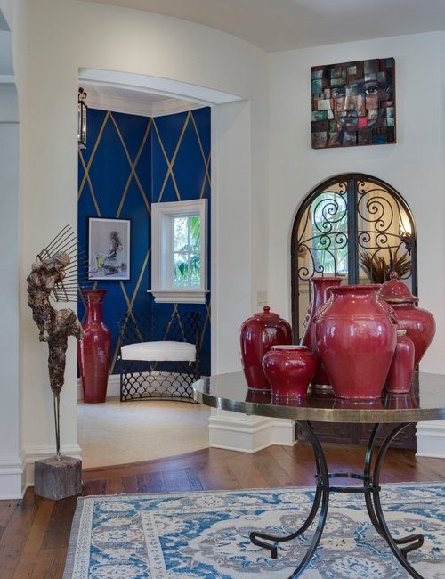
Perhaps it’s one of the biggest challenges for anyone decorating a room: color coordination. Sure, it’s easy to pick out a favorite color or two, but when it comes to putting them together to create a cohesive space, your idea of what works might not be what’s best for your room.
Here’s how the best interior designers use color to coordinate a room perfectly.
So if you’re planning to decorate a space in your home soon, make sure that you have these color coordinating tricks handy:
Go back to your most basic tool, the color wheel.
You loved it when you were young and it will be your best friend now that you’re decorating your space. Even the best interior designers go back to the color wheel when trying to pick out the best paint colors for their projects.
The trick here is to choose color families that relate well to each other. It will take some trial and error, but the color wheel is your best tool for validating if your color scheme ideas are going to turn out well or not.
Combine related colors.
This is one of the oldest tricks in the design book simply because it works. If you want a subtle yet elegant color scheme in your room, you can opt to use colors that are adjacent to each other and apply them in different furniture and décor around the space.
Although similar tones are not necessarily striking, they make a space feel clean and comfortable without making it look too busy.
Add hints of complementary colors.
These colors are placed on the opposite sides of the color wheel and they offer that much-needed pop of color into a space. The trick here is to pair dominant colors with subtle hues so they don’t clash.
Depending on what theme you’re going for, you can play with different complementary color combinations to achieve the feel that you want for your space.
Choose an accent color.
Every room needs a focal point that will bring the entire space together. Choose a focal wall where you can use an accent color and pattern that will serve as the centerpiece of the space.
You can then work on more subtle details for the rest of the room to tie the décor together and promote consistency throughout your color scheme.
Learn about the 60-30-10 rule.
Finally, you can’t miss learning about the one rule that most interior designers follow when coordinating colors in a room: the 60-30-10 rule.
It simply means that the primary color that you chose for a room should take up 60% of its design, the secondary color should take up 30% of the design and the accent color should take up 10% of the design. You can apply this rule not only to your paint but also to your décor and furnishings.
Color coordinating a room doesn’t have to be complicated. Keep your color selection to a minimum and play with different hues if you don’t want your space to feel too monotonous.

